16 Useless Infographics

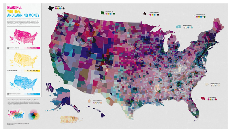
It's quite ironic that you need a map to navigate this map of the US. The key in the bottom-left corner explains that the colours are based on three maps overlayed. Oh! Right! We get it now! (We don't really, it's just embarrassing to admit sometimes).
Photograph: GOOD/Gregory Hubacek
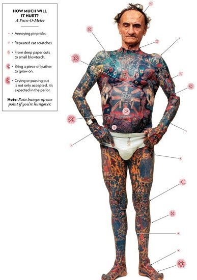
Thinking of getting a tattoo? Find out how much it will hurt first. Photographs are becoming increasingly popular in infographics — just make sure they're nice to look at.
Photograph: Tatopia
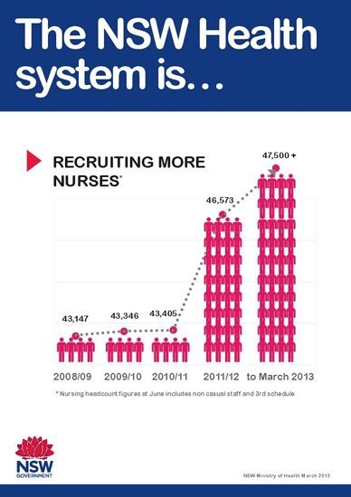
Sometimes, you get the feeling that an infographic is deliberately trying to mislead you. This one from New South Wales shows the increase in the number of nurses — which is factually correct — the only problem is that you get a very different sense of scale from studying the image than you do if you just glance at it. Four stick people represent 43,000 nurses — so why are 28 more stick people used to represent an increase of just 3,000 nurses? That's a 700% infographic explosion to show a 7% increase. We can only assume someone leant on the paste key.
Photograph: NSW
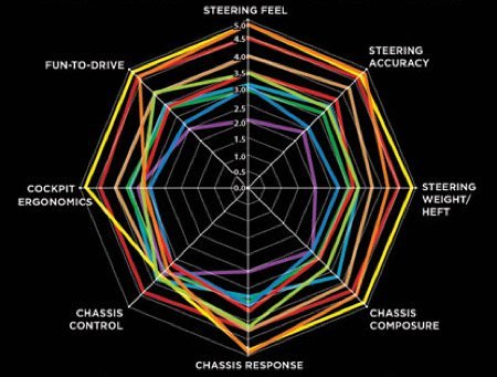
Radar charts can be handy when you need more than two axes, for example when you want to compare products. In this case, the products being assessed are cars — making it all the more ironic that we can't find the key.
Photograph: Motor Trend
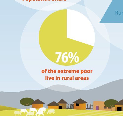
This one falls into the 'hang on, wait a minute!' camp. Who knew that slightly more than 3/4 looked like slightly less than 3/4? A serious topic that the World Bank failed to represent accurately. Our resident big data pedant calls these infauxgraphics.
Photograph: World Bank
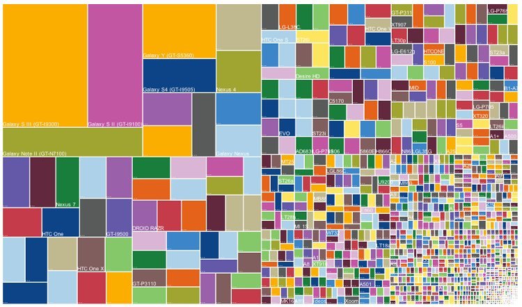
Treemaps are infographics that show hierarchical information, where the size of each 'leaf' should represent some aspect of the data. This treemap shows how when an android phone is released, lots of different versions can spin off it. Visually, you can see that lots of modifications have taken place (and it does look like a lovely sweet-wrapper), but it's hard to say anything more than that.
Photograph: Popsci
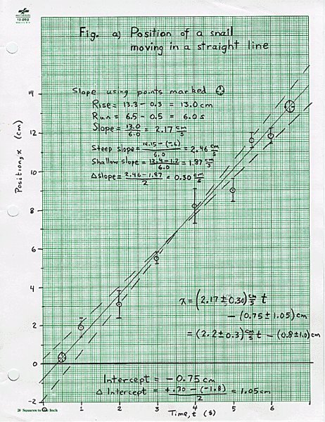
Nothing wrong with a hand-drawn graph either. Except a confusing one — we reckon this one could be enough to make even the snail veer off course.
Photograph: guardian.co.uk
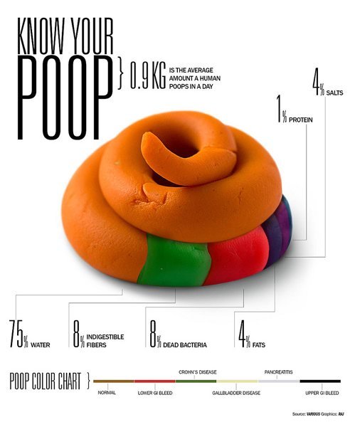
This is a shit infographic. Poop
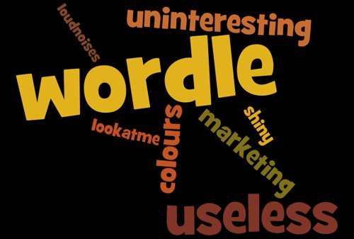
Welcome to the wonderful world of wordles. This one has been made by John Burn-Murdoch, a member of our data team — he swears he made it satirically but we're not so sure.
Photograph: Wordle
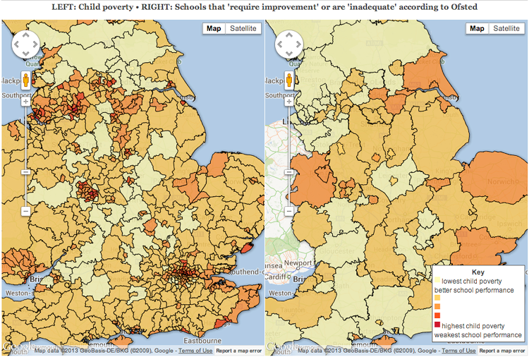
We mess up too. Having dredged up lots of data we made these side by side interactive maps to see how poverty and academic success compare. But as some of our readers pointed out, the maps don't really answer the question 'are the worst schools really in the poorest areas?' — they don't group their findings in the same way (the left map shows local authorities and the right shows constituencies) and the colour scale is doesn't make it easy to spot any correlations. Quite embarrassing really.
Photograph: Guardian
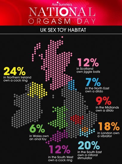
National orgasm day. Because a national orgasm month would be excessive, not to mention distracting. But Ann Summers, a company which describes itself as "the UK's leading erotic lifestyle retailer" has given us this endlessly informative piece of information. Don't be confused about the fact that different colours represent the same thing. Or the fact that the circles don't represent percentages. Focus on your new-found knowledge that people in Northern Ireland are 2x more likely than those in the South West to own a cock ring. Hang on, 1 in 4 people in Northern Ireland has a cock ring? Well I never.
Photograph: Ann Summers
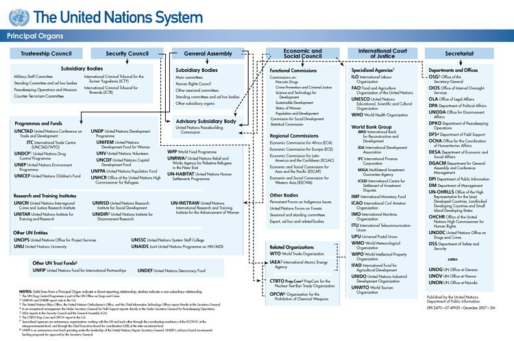
Ah the organogram. Every management consultant's dream. This one comes from the United Nations and offers a snappy insight into how the Secretariat relates to the — oh no, wait, I can't see where that dotted line goes. Never mind.
Photograph: UN
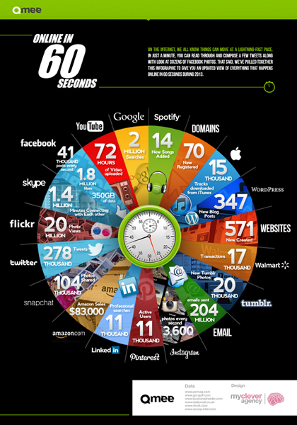
Though 'email' and 'Pinterest' don't occupy the same amount of our time online, they each get the same sized slice in this confusing inforgraphic about what a minute on the Internet looks like. You know you have a bad infographic when it raises more questions than it answers — which country are we talking about? Is this what the average minute at noon looks like or the average minute at midnight? The average minute in July or in December? How did that list of sources (which includes dailymail.co.uk who conveniently later published the infographic) get their hands on this data?
Photograph: My Clever Agency
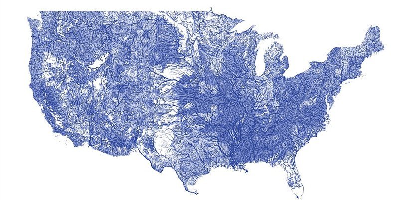
Last month we were going to feature this on the Show&Tell section of our website. It's a beautiful take on a traditional map that's used detailed data to show ever river in America. Then something else caught our eye and we decided against including it. Sometimes a visualisation doesn't turn out in quite the way you expect. (If you still can't see it, we'll blushingly give you a clue — the south east of America is looking very fertile).
Photograph: Nelson Minar
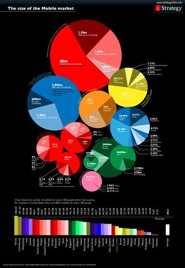
Often, companies that have stuck an 'i' infront of a noun to name themselves raise our suspicions. Istrategy's strategy for this infographic looks like it was something along the lines of 'let's do some pie charts, then add some bar graphs, oh and then we can add some more pie charts and oh yeah some more bar graphs oh yeah and then what about some...'
Photograph: Istrategy
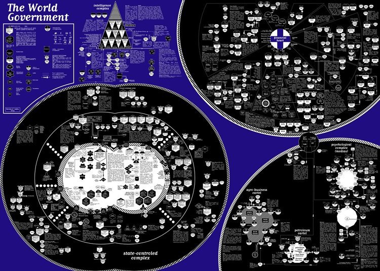
The 'the-end-of-the-world-is-nigh' infographic. This one gives you a go-to guide on where the rating agencies, lobbies, mafias and think tanks are. The only problem is we don't have any idea where the 'where' is. Bureau d'etudes